Front-End Configuration
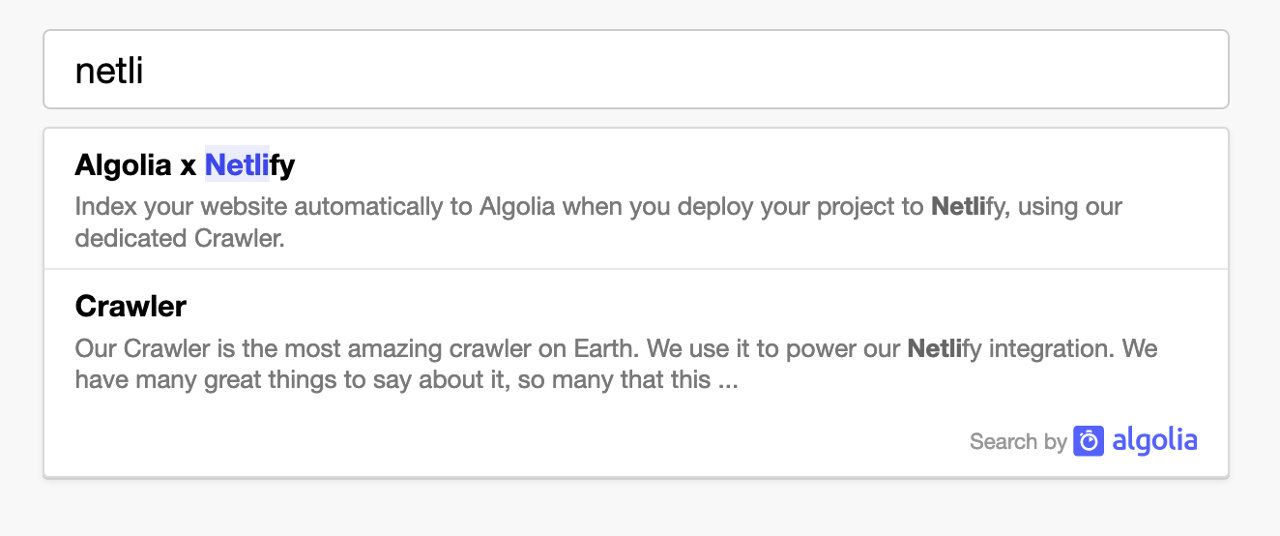
With the official Algolia plugin for Netlify, Algolia recommends to use this front-end bundle. It’s designed to be compatible with the index structure extracted by Algolia’s Netlify plugin. It creates a new search input on your site with an autocomplete menu, providing search as you type results.

Usage
1
2
3
4
5
6
7
8
9
10
11
<link rel="stylesheet" href="https://cdn.jsdelivr.net/npm/@algolia/algoliasearch-netlify-frontend@1/dist/algoliasearchNetlify.css" />
<script type="text/javascript" src="https://cdn.jsdelivr.net/npm/@algolia/algoliasearch-netlify-frontend@1/dist/algoliasearchNetlify.js"></script>
<script type="text/javascript">
  algoliasearchNetlify({
    appId: '<YOUR_ALGOLIA_APP_ID>',
    apiKey: '<YOUR_ALGOLIA_API_KEY>',
    siteId: '<YOUR_NETLIFY_SITE_ID>',
    branch: '<YOUR_TARGET_GIT_BRANCH>',
    selector: 'div#search',
  });
</script>
Available options
Options
appId
|
type: string
Required
Application ID, can be found at https://www.algolia.com/account/api-keys/ |
||
apiKey
|
type: string
Required
API Key, can be found at https://www.algolia.com/account/api-keys/ |
||
siteId
|
type: string
Required
Netlify Site ID, can be found at https://crawler.algolia.com/admin/netlify |
||
branch
|
type: string
Required
Target git branch, Either a fixed one, for example ‘main’, or a dynamic one using |
||
selector
|
type: string
default: div#search
Required
The element that the autocomplete will replace. This shouldn’t be an input. |
||
analytics
|
type: boolean
default: true
Optional
Whether to enable search analytics. |
||
hitsPerPage
|
type: number
default: 5
Optional
The number of results to display. |
||
placeholder
|
type: string
default: Search...
Optional
The input placeholder. |
||
openOnFocus
|
type: boolean
default: true
Optional
Whether to open the search panel with a default search, when focusing on the input. |
||
detached
|
type: string
default: { mediaQuery: '(max-width: 500px)' }
Optional
Decide when the search popup should open in detached mode (full screen, modal experience).
Can be set to
Copy
|
||
theme
|
type: object
Optional
Change the visual aspect of the autocomplete.
Copy
|
Using multiple branches
If you’ve set up the plugin to index multiple branches using the branches option, each configured branch has a dedicated index.
You also need to pass the information of which index you want to search in using the branch parameter of the integration.
To get access to the currently building branch, you can configure your build tool to forward the HEAD environment variable.
For instance, with webpack’s environment plugin configured to forward HEAD, you would pass branch: process.env.HEAD.
If you’ve configured your plugin to index only specific branches, you need to duplicate the logic here so that it picks the correct branch only when appropriate.
For instance, with branches = ['main', 'develop', 'feat/*'], and using webpack’s environment plugin to inject HEAD, here’s how the snippet could look like:
1
2
3
4
5
6
7
8
9
const currentBranch = process.env.HEAD; // Injected by your build tool
let targetBranch = 'main';
if (currentBranch === 'develop' || currentBranch.startsWith('feat/')) {
  targetBranch = currentBranch;
}
algoliasearchNetlify({
  // ...
  branch: targetBranch,
});
Theme
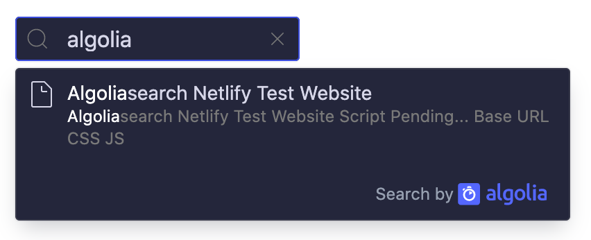
You can theme the input and the autocomplete by using the theme property.
1
2
3
4
5
6
7
8
9
10
// Example of dark theme:
{
  theme: {
    mark: '#fff',
    background: '#23263b',
    selected: '#111432',
    text: '#d6d6e7',
    colorSourceIcon: '#d6d6e7'
  }
}

To go further you should take a look at the autocomplete.js documentation, or implement your own search with InstantSearch.js.
