Product Card
We released React InstantSearch Hooks, a new InstantSearch library for React. We recommend using React InstantSearch Hooks in new projects or upgrading from React InstantSearch.
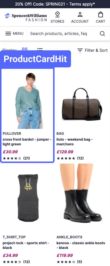
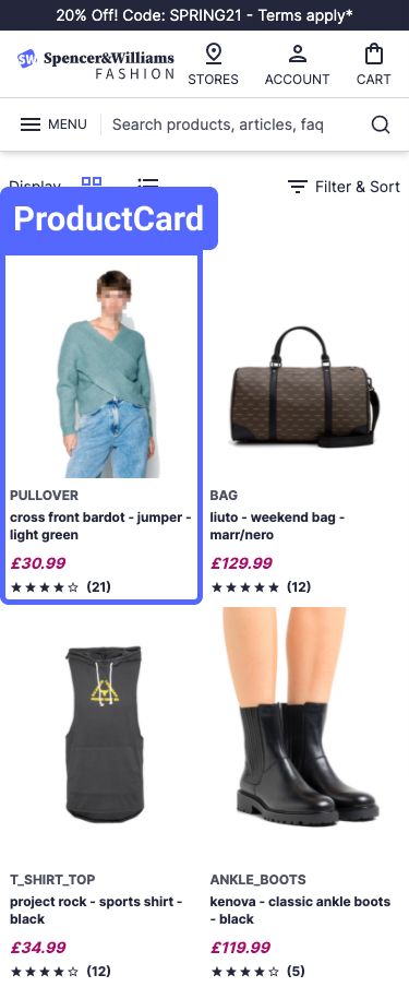
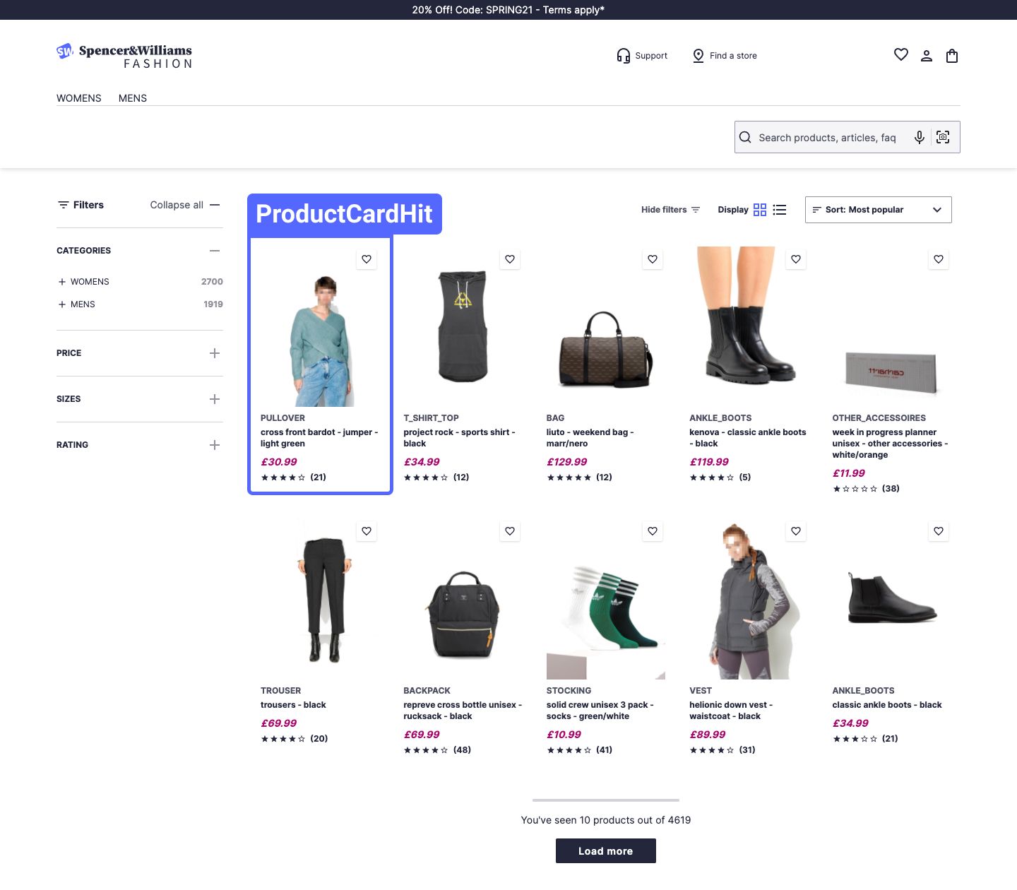
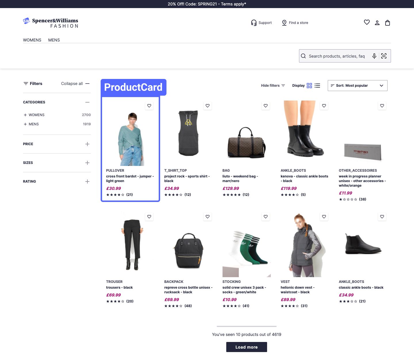
The Product card components allow you to show your product data from an Algolia index as a product card. Use:
- The
ProductCardHitcomponent to map your Algolia dataset attributes to theProductCardcomponent props. - The
ProductCardcomponent to display product information through a highly customizable component.
Map your record structure
The ProductCardHit component creates a bridge between the Hits object from React InstantSearch and the ProductCard component.
The ProductCardHit component is a React InstantSearch widget that maps your Algolia dataset attributes to the ProductCard component props. It also sends an event, using the JavaScript Search Insights client, each time a ProductCard is clicked.
Code summary
Although you can use the ProductCardHit component on its own, most of the time you’ll use it with the InfiniteHits component. InfiniteHits retrieves the results matching the current search state and passes them to the ProductCardHit component.
You can create your own ProductCardHit component by modifying some props. For example, the Showcase component uses a ProductCardHitShowcase component based on ProductCardHit. In the Showcase, highlighting isn’t used, and a custom Algolia Insights event name is used to indicate that a click on a ProductCardHitShowcase component came from the home page.
You can customize ProductCardHit in:
- The product listing page
- The
ProductCardHitfile - Its props.
Usage and props
1
2
3
<InfiniteHits
  hitComponent={ProductCardHit}
/>
Customize the product card
The ProductCard component lets you display product information in a highly customizable way. For example, you can show product cards in a list or grid view, use multiple tags, or grey out the card if the product is unavailable. It also leverages Algolia’s highlighting and snippeting feature to show why a product card matches the current query.
Code summary
You can customize ProductCard in:
- The product card hit file
- The
ProductCardfile - Its props.
Usage and props
1
2
3
4
5
6
7
8
9
10
<ProductCard
  view="grid"
  label="Trouser"
  title="Black trouser"
  description="A black trouser"
  image="http://example.com/black-trouser.jpg"
  price={69.90}
  rating={4}
  reviews={32}
/>
External packages used
The “Product card” components depend on these npm packages:
| Package | Description | Used by |
|---|---|---|
react-fact-compare |
Compares the current and next props provided by the connectHitInsights connector and decide whether to trigger a re-render |
ProductCardHit |
react-instantsearch-dom |
Provides the connectHitInsights connector that passes down a hit object along with an insights function used to send events to the Algolia Insights API |
ProductCardHit |
search-insights |
Provides report click, conversion, and view metrics using the Algolia Insights API | ProductCardHit |
classnames |
A utility for conditionally joining CSS class names | ProductCard |
